Eram Freedom, Quality, Levity
A melodious, stylish visual identity
“Eéééééééram, you’d be crazy to spend more!” This major brand exaggerates its cheerful melodious é while affirming itself with a more stylish typography reminiscent of a fashion magazine header. Written in a registered black block type, the name is offbeat, like the brand. The color 100 % Yellow is 100 % optimistic. The accent on the é gets away to alight in small humorous Yellow Twist touches throughout the store.
A giant dressing room
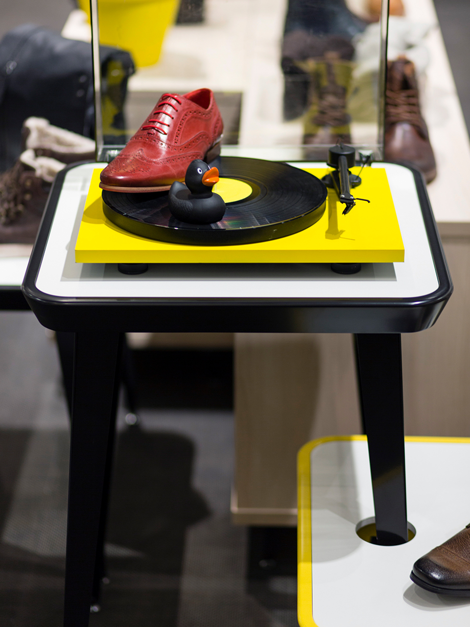
For Éram’s young, active, attractive, urban target customer, the agency imagined the store like a spacious dressing room. The quasi-industrial building shell contrasts with the atmosphere of a loft warmed up with light wood, textiles on the floors and a line of tailor-made furnishings. The styling adds additional touches of humor, with stepladders turned display shelves and accessories laid out on a vintage turntable. Just as quirky on the exterior, the slightly recessed interactive façade creates a break amongst storefronts that calls out to the customer.


Two-in-one eco-responsible packaging
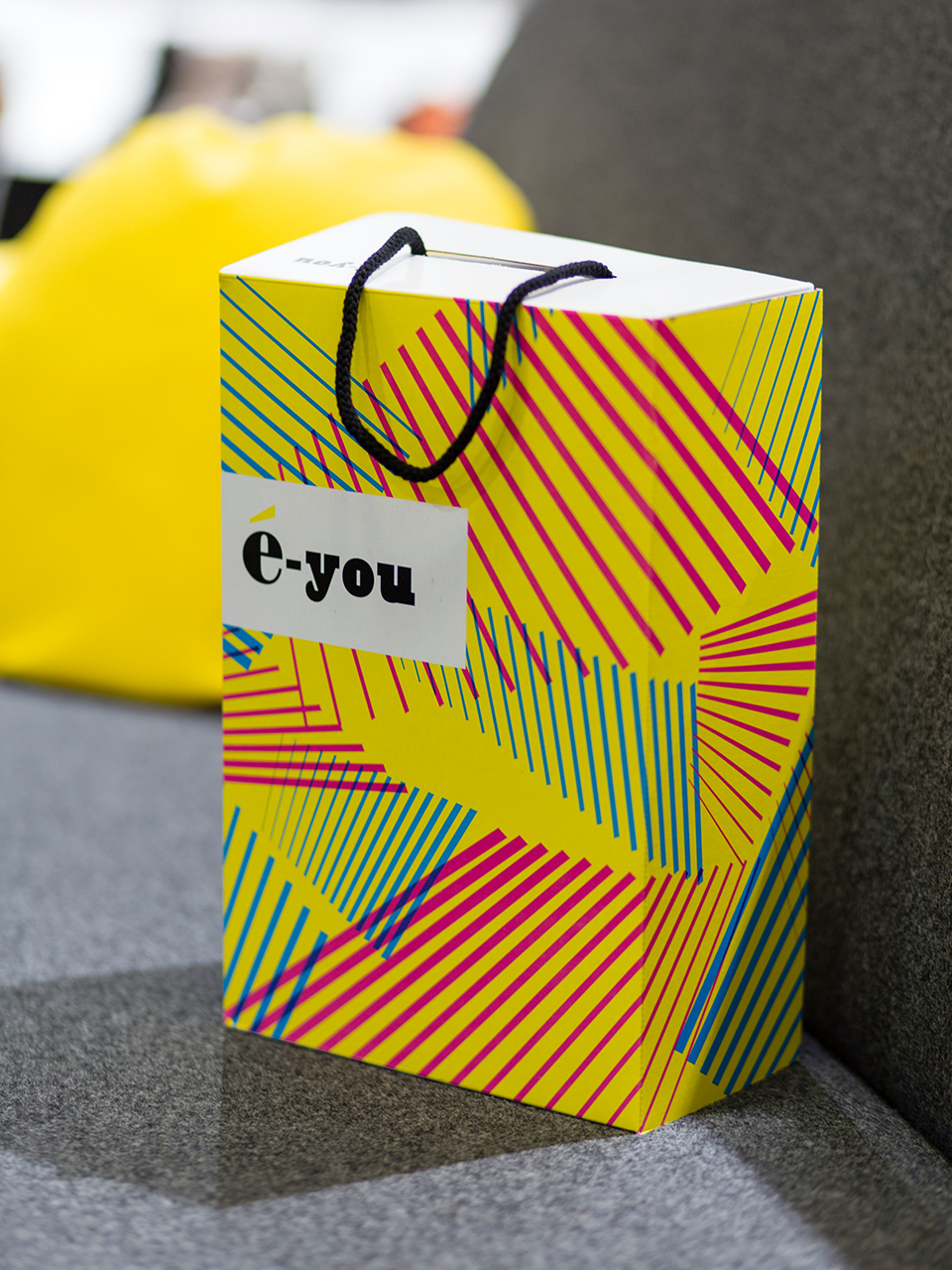
An ingenious packaging system transforms a shoe box into a stylish bag. Economizing is chic!
A popular brand on a small budget
Offering accessible prices means keeping costs to a minimum. By choosing raw materials, neutral tones of white, gray and black, and a simple, clever and modular layout that’s quick and flexible to use, the agency designed the new store for the same cost as the old one.
Advertising by Étienne Chatiliez, Benoît Devarrieux and Philippe Michel, founder of CLM/BBDO.
A winning
project!
- Grand Prix Stratégies du Design 2007
- Prix de l’Identité Visuelle.
- Janus du Commerce
- 2007 et 2013


