Keolis More ways- More life
From white label to militant brand
One of the global leaders in public transport, long at the service of cities to which the group provides its expertise, today Keolis wants to unveil its know-how about a new kind of mobility that’s more autonomous, connected and based on sharing, all in the service of living better together.
- 17 countries
- 3 billion annual travelers
- N°1 in the world and pioneer of the automatic subway
- N°1 in the world for tramways
- 10 different modes of transportation


The omega of mobility
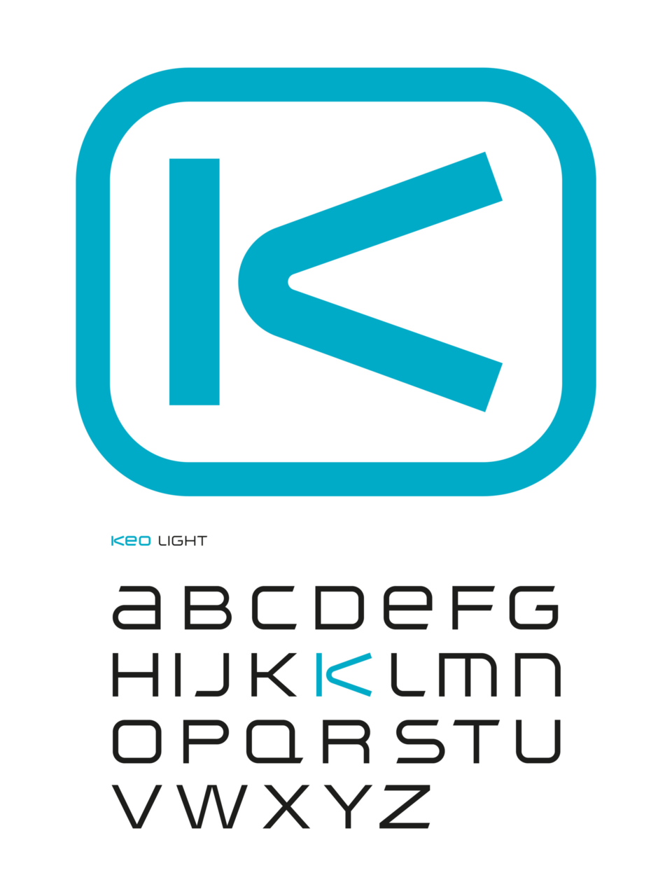
The new Keolis logo announces its leadership position, with a strong promise of openness, mobility and fluidity. A graphic and powerful Greek letter, the open “K” indicates a committed logotype. Against a vertical bar, the other two bars form a detached V that resembles a boomerang. The “K” of Keolis becomes the omega of shared mobility. The color duo of blue lagoon, signifying expertise and technology, and taupe gray, symbolizing territorial anchoring, combines with a rounded, fluid typography that evokes traffic flow.
A new signature: “More ways, more life”
A pioneer of multimodality, Keolis advocates for mobility that improves users’ quality of life and the everyday vitality of territories. Its signature is aimed at both inhabitants and local partners with whom the brand is committed to promoting collective intelligence to imagine the mobilities of tomorrow.
A winning
project!
- Janus de la marque
- 2017


