Air Liquide
Creative Oxygen
Making a new product offer legible: the world’s No. 1 in gases, technologies and services for industry and healthcare, acquired the American Airgas in 2016 and launched its 2016-2020 corporate program NEOS to perform over the long term and contribute to a more sustainable world. In this way, Air Liquide marks its entry into a new phase in its history, and evolves its identity to reveal the transformation of the Group, close to its stakeholders and open to the world.
Key information
World leader in gases, technologies and services
Acquisition of Airgas (USA) in 2016
4 million customers and patients
66,300 employees
60 countries
Prizes & awards
TOP/COM Grands Prix
Gold, Corporate 2018
Marking Air Liquide’s transformation
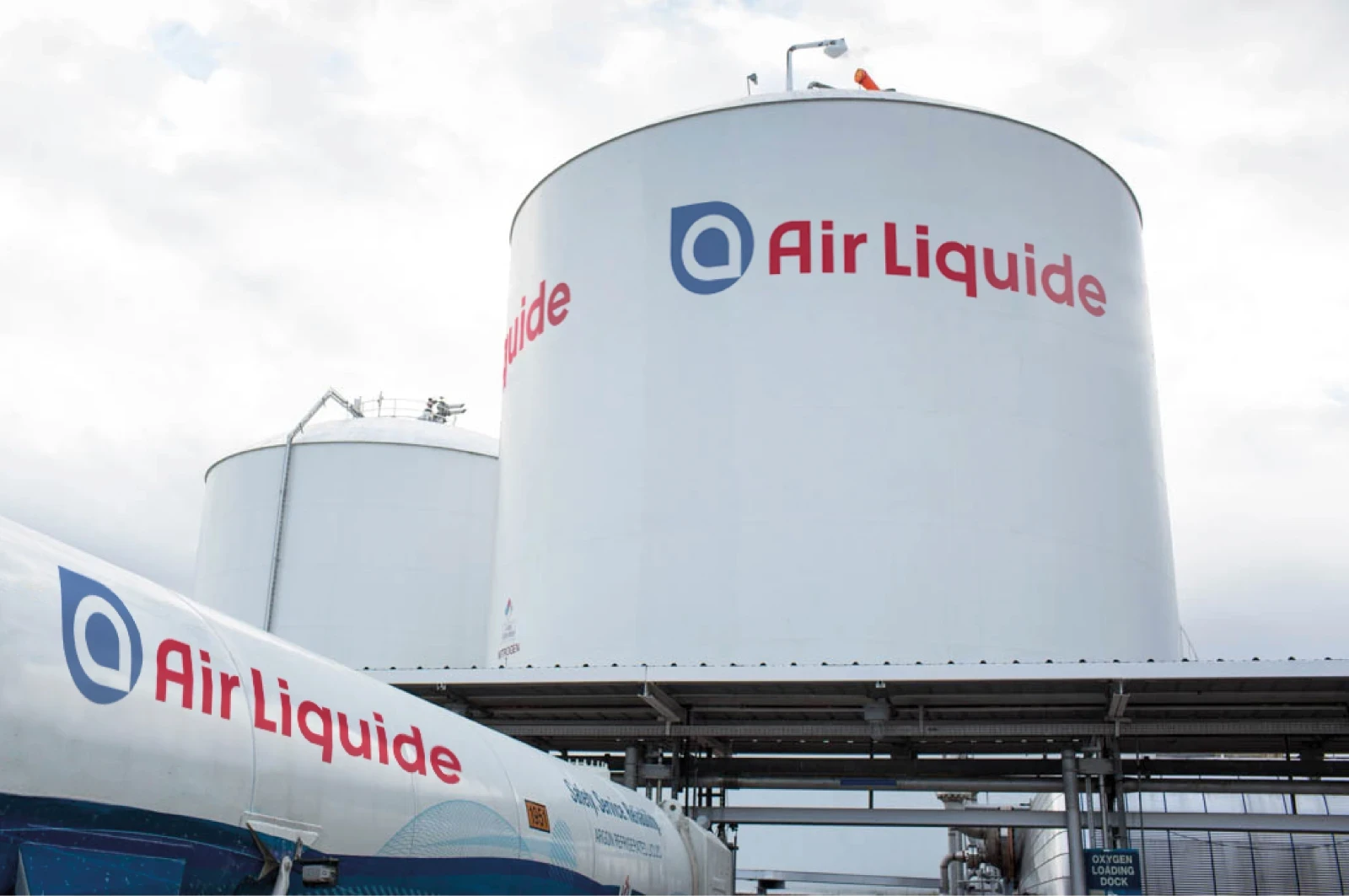
To support its transformation strategy, the Group unveils the 5th logotype in its 155-year history. The first expression of the brand’s openness to the world, the removal of the frame of the old logotype allows a new symbol to breathe, the Alpha. Powerful and organic, it embodies both Air Liquide’s roots (air, water) and its evolution.
The sign, drawing a bubble of water in a bubble of air, is associated with the brand’s fundamentals: its name, its colors, its construction. A marker of openness, proximity and responsibility: 40% of Air Liquide’s sales today concern solutions to protect life and the environment. Its scientific culture and capacity for technological innovation are embodied in the sign that evokes the hand gesture, formed by the thumb and index finger, confirming that everything is OK.
Playing on both roundness and precision, the graphic style of the new logotype combines the power and agility of a big CAC 40 brand. Finally, the historic blue is warmed by a touch of red, on a white background for greater clarity.

Air Liquide is transforming, and it shows!
Enriched with typography, colors, graphics and illustrations, the new graphic charter guarantees the consistency of the brand’s visual universe and international communications. With a powerful new visual identity, world leader Air Liquide confirms its commitment to long-term performance, for a more sustainable world.


From the monogram to the Alpha: a strong, recognizable new symbol for a major CAC 40 brand.


