
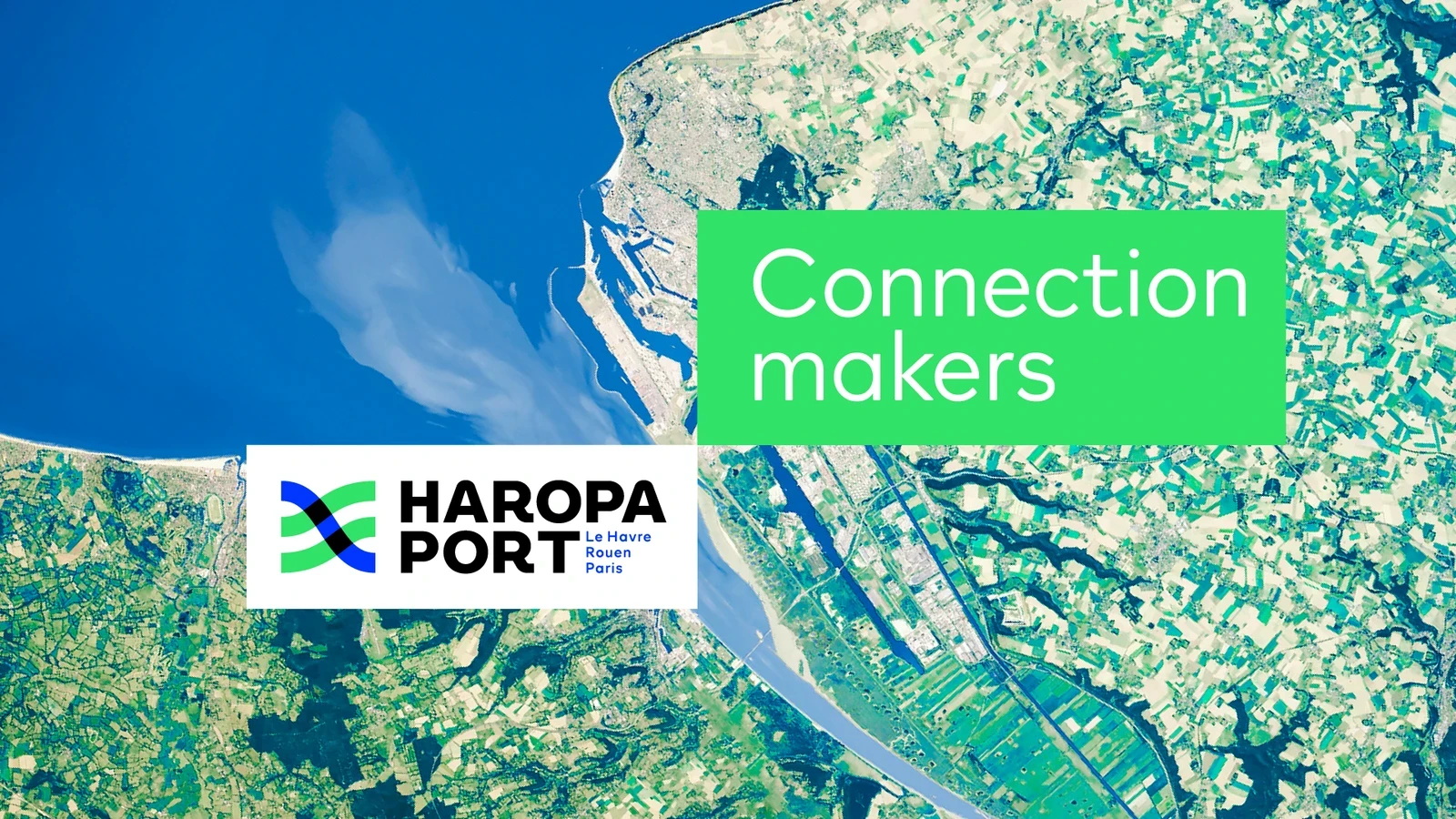
Haropa Port
Le Havre | Rouen | Paris
How to reveal the new challenges of port logistics, through a platform and a brand story, a signature and a new visual identity? Engaged in a convergence process since 2012, the ports of Paris, Rouen and Le Havre are taking another decisive step forward in 2021, by uniting under a single international brand: HAROPA PORT. A major new economic and environmental asset for the country.
“Paris, Rouen, Le Havre, a single city with the Seine as its main street”.
Napoléon Bonaparte (1802)
Key information
No. 1 logistics hub and No. 1 foreign port in France
4th North European port in tonnage
+10% investment in ecological transition
160,000 direct jobs
Prizes & awards
TOP/COM Grands Prix
Silver, Corporate 2022
What’s the idea?
Saguez & Partners worked for 18 months with the company’s management teams to make this unification project clear. Together, they came up with a new brand in line with HAROPA PORT’s ambition and strategy. Following an audit and market analysis, a new reason for action was born: to develop a resilient, agile and sustainable networked port model in the face of the world’s new challenges. This is embodied in a new signature, Connection Makers, and a new identity territory that makes sense for all stakeholders.
- Develop a resilient, agile & sustainable networked port model to meet the challenges of the new world.
- Develop a network of sustainable, high-performance & connected logistics platforms from the sea to the heart of Paris.
- Build a resilient, agile & sustainable port model to meet the challenges of the new world.
- Create the human & sustainable port of the new millennium.
- Co-construct the Seine-based network of sustainable platforms.
Symbol of a virtuous and sustainable network
In blue, the Seine, and more broadly water; as well as maritime and river transport in the broadest sense. In green, nature and regional vitality. The players in this fluid, sustainable ecosystem, all closely linked to the river, are represented at the crossroads of the flows. The three lines, like the three ports of the Seine axis, combine to form a harmonious whole and loop, a symbol of absolute fluidity. The two colors are interacting with each other, meeting, crossing and blending. The typography that accompanies the symbol is intended to be powerful and singular. The fluidity of the river is reflected in the curves of the A and R. The thickness of the capitals and the black color maximize the legibility of the name by playing on contrasts.

Balancing economic and environmental development
Haropa is committed to the ecological transition on behalf of its customers and partners, and promises business solutions for a more sustainable, more responsible supply chain. Thanks to its new brand platform, supported by a brand narrative, a singular signature and a strong new visual identity, HAROPA PORT will develop the power and attractiveness of the Seine axis both nationally and internationally, and contribute to France’s ecological transition policy with a new resilient and virtuous port model.
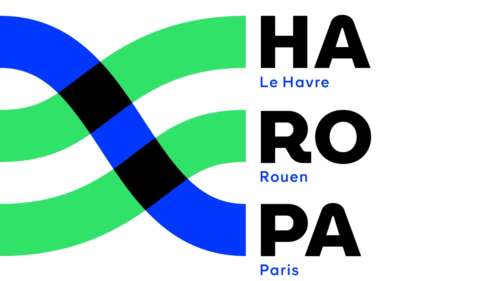

In blue, the Seine: water, maritime and river transport. In green: nature and regional vitality.


